CI Manual
We introduce the CI of SK Networks.
Meaning of the CI
The logo is the most important element in our identity, as it represents all aspects of SK Networks including its products and services, as well as its trustworthiness, quality and top-tier position. The logo is the official symbol of SK Networks, so its figure should not be changed in any way. The logo, used in various media including print and promotional materials, plays an important role in delivering the corporate and brand image of SK Networks.
Clear Space
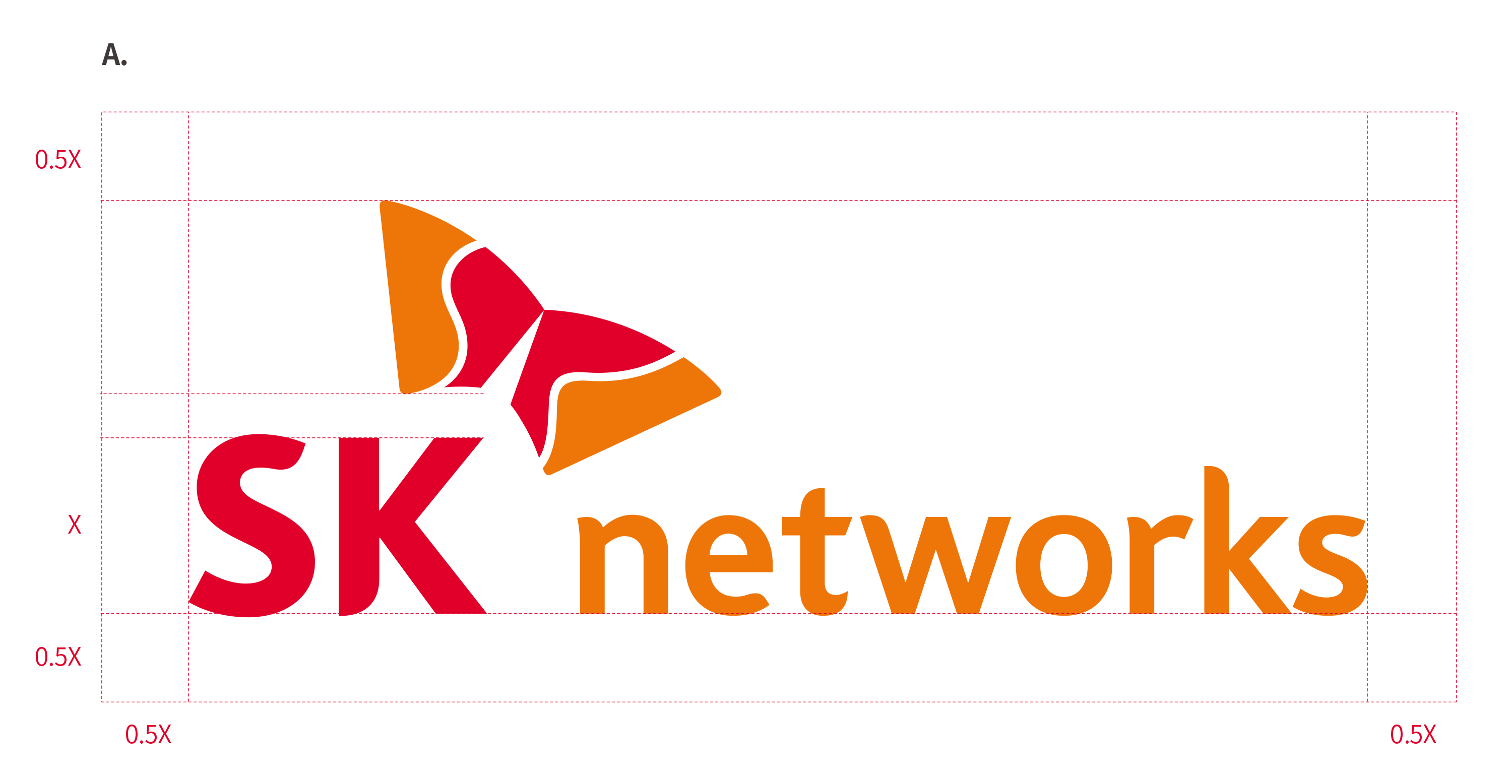
Clear Space A
When applying the SK Identifier, make sure to have sufficient clear space according to these guidelines. Assuming the letter “K” of the logo mark is X high, there should be 0.5 times around the space of X in all directions.
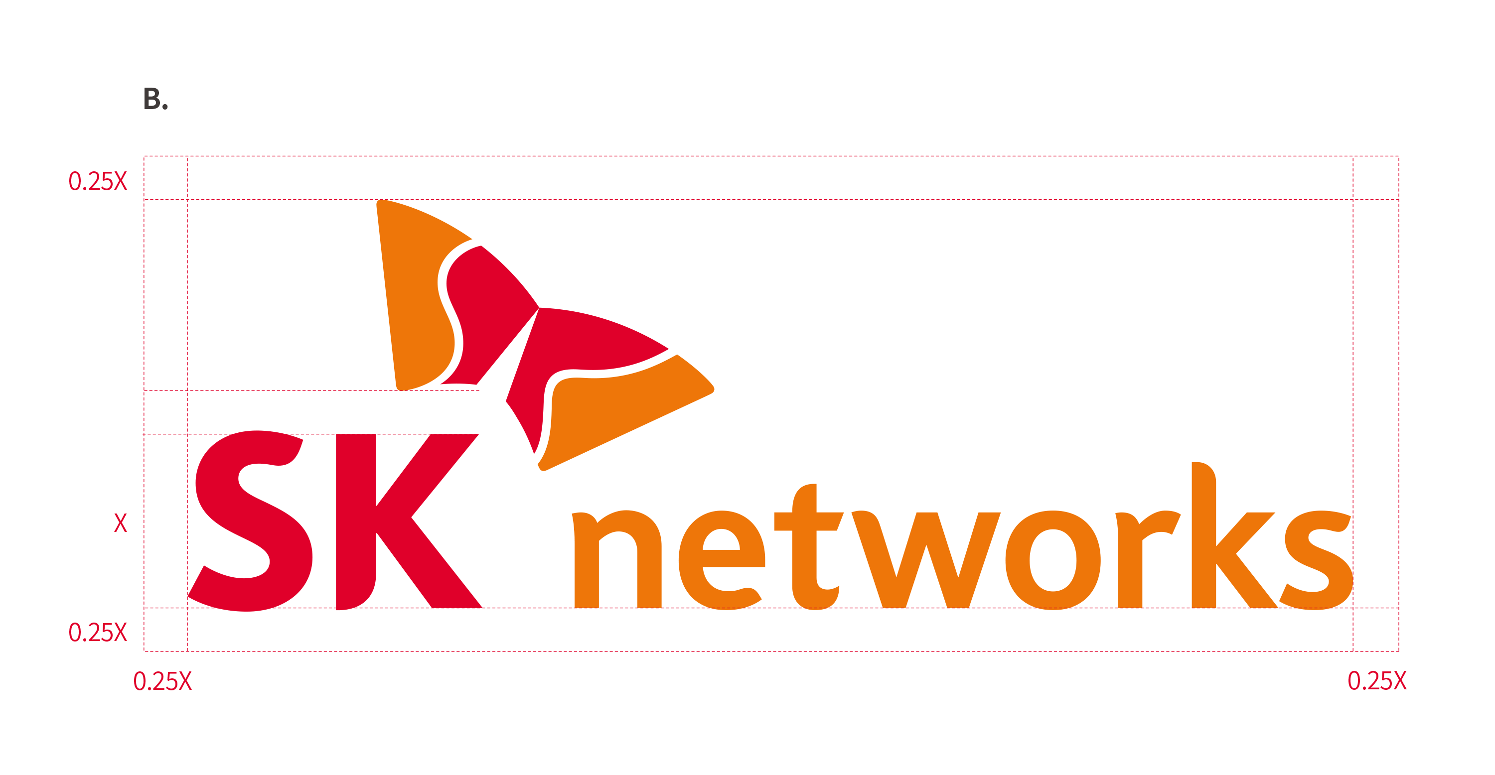
Clear Space B
This particular rule is applicable only if it is difficult to secure visibility due to space limitations and it is important to maximize the visibility of media applications such as digital medium, outdoor billboards. Assuming the letter “K” of the logo mark is X high, there should be 0.25 times around the space of X in all directions.
Corporate Color
SK’s color are composed of its primary colors and secondary colors. SK Red and SK Orange are SK’s representative colors. These guidelines must be observed because the consistent application of SK’s colors ensure the proper representation of SK’s image.
Primary Colors
-
SK Red
- PANTONE186C
- CMYK0 / 100 / 81 / 4
- RGB234 / 0 / 44
- HEX#EA002C
-
SK Orange
- PANTONE158C
- CMYK0 / 66 / 97 / 0
- RGB255 / 122 / 0
- HEX#F47725
Secondary Colors
-
SK Yellow
- PANTONE7408C
- CMYK0 / 20 / 100 / 0
- RGB251 / 188 / 5
- HEX#FBBC05
-
SK Green
- PANTONE2292C
- CMYK43 / 0 / 100 / 0
- RGB155 / 207 / 10
- HEX#B3CF0A
-
SK Teal
- PANTONE3275C
- CMYK100 / 0 / 50 / 0
- RGB0 / 154 / 147
- HEX#009A93
-
SK Blue
- PANTONE300C
- CMYK100 / 50 / 0 / 0
- RGB0 / 114 / 198
- HEX#0072C6
-
SK Navy
- PANTONE288C
- CMYK100 / 79 / 0 / 37
- RGB14 / 48 / 109
- HEX#0E306D
-
SK Purple
- PANTONE526C
- CMYK75 / 100 / 0 / 0
- RGB104 / 33 / 122
- HEX#68127A
-
SK White
- PANTONEWhite
- CMYK0 / 0 / 0 / 0
- RGB255 / 255 / 255
- HEX#FFFFFF
-
SK Black
- PANTONEBlack
- CMYK0 / 0 / 0 / 100
- RGB0 / 0 / 0
- HEX#000000
Background Color Scheme
When expressing the SK CI in color, the default background color is white.
Other background colors may be used as long as the visibility and image representation of SK CI are clear.
Avoid using the CI over background which do not provide enough legibility or cause visual figure. Refer to the exampls below.
Background Color Usage
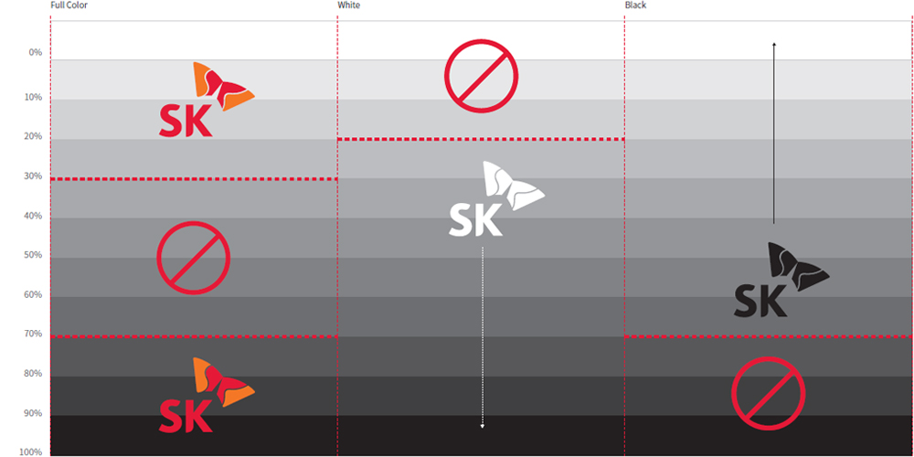
Background Color Scheme